Using the Interactive Charts
Visualize the data to fit your needs. Explore and customize each interactive chart by filtering and isolating the data that is useful to you — and creating a customized visualization to share.
Learn more about:
Tooltips
Saving Customized View
Data Customization
Sharing and Embedding
Sorting
Downloading the Raw Data
Resetting the Chart
The Survey Data
Tooltips
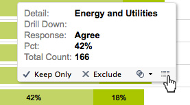
Hover over an individual data point to reveal a tooltip with explanatory details for that data point. Use the toolbar to isolate the data point, exclude it from your analysis or view the underlying data.

Data Customization
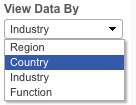
Use the dropdown menus next to each chart to discover the information most relevant to you.
“View Data By” different categories such as industry, geographic region, country or function. Note that for country views, only those countries with a minimum of 30 responses were included.
“Drill Down By” additional data layers to provide more granularity and insights.
- Maturity Group: How respondents in different maturity phases answered questions.
- Role: How respondents in different roles answered questions. Note that all respondents at the C-Suite level and above are categorized as executives in the visuals.
- Organization Size: How respondents from different sized organizations answered questions. Note organization size is based on employee headcount.
- B2B vs B2C: How respondents from B2B vs. B2C organizations answered questions.
“Filters” enable further analysis. Use the dropdown filters to isolate information about an industry, region and/or B2B/B2C organization type across the entire visualization.

Note that for country views, only those countries with a minimum of 30 responses were included.
Sorting the Data
Once you've customized the data, you can re-sort the data on the x-axis.

Sort ascending: Sorts smallest to largest percentage.
Sort descending: Sorts largest to smallest percentage.
View Data: Reveals underlying data for the visualization.*
* Please note: These visualizations were intended to show trends in responses. Small discrepancies may be due to rounding errors.
Saving Your Customized Visualizations
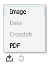
After you've applied filters and other customizations to an interactive chart, you can share a customized view of the data as an image (png) or a PDF file.
Use the toolbar at the bottom of the chart to select the format in which to download your customized data.*

*Please note: These visualizations were intended to show trends in responses. Small discrepancies may be due to rounding errors.
Share or Embed the Interactive Chart
You can share the interactive chart with your network or on your site by using the share tools  in the bottom left-hand corner of the visualization. There are options for linking to your Facebook and Twitter, and for embedding it into your own website.
Please note: All data is copyright Massachusetts Institute of Technology. When citing the material, credit MIT Sloan Management Review and Deloitte University Press, and link back to the report, at https://dev03.mitsmr.io/projects/moving-beyond-marketing/.
Resetting The Chart to Original View
Use the revert button in the visualization's footer to reset the data to its default state. This will undo any customization you've done to the chart.
Downloading The Raw Data
You can download the data as an Excel file to view in Microsoft Excel and other applications.
You can also access the entirety of the raw data as Tableau Public workbook by clicking on the download button in the bottom right-hand corner of the interactive chart. You will need to install the free Tableau Public application to view and manipulate the data.*
Disclaimer: The data is provided "as is." The user assumes the entire risk related to its use of this data. MIT Sloan Management Review and Deloitte University Press make no representation or guarantee with respect to data provided by either Party for further use by third parties.
* Please note: These visualizations were intended to show trends in responses. Small discrepancies may be due to rounding errors.
About the Data
Data is based on responses to the 2014 MIT SMR/Deloitte Social Business Survey. The survey, conducted in the fall of 2013, included responses from 4,803 business executives, managers and analysts across industries and geographies, and involving organizations of a broad range of sizes. Note that all respondents at the C-Suite level and above are categorized as executives in the visuals.
You can download the survey questions (PDF) or download the raw data (.xlsx) to view in Microsoft Excel and other applications.
Social Business Maturity
We asked respondents to rate on a scale of 1 to 10 the maturity of their organization’s social business practices. Organizations whose respondents rated their organization’s social business practices as 1-3 were categorized as “early”; 4-6 were categorized as “developing”; and 7-10 were categorized as “maturing.” Read the full report to learn more about social business maturity.


